The Enduring Appeal of Macintosh Picasso Artwork
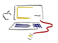
The famous Macintosh Picasso logo was developed for the introduction of the original 128k Mac back in 1984. A minimalist line drawing in the style of Pablo Picasso, this whimsical graphic implied the whole of a computer in a few simple strokes. It was an icon of what was inside the box, and became as famous as the computer it represented.
The logo was designed by Tom Hughes and John Casado, art directors on the Mac development team. Originally the logo was to be a different concept called The Macintosh Spirit by artist Jean-Michel Folon, but before the release Steve Jobs changed his mind and had it replaced by the simple and colorful drawing by Hughes and Casado. It’s been beloved ever since, and the graphic style has endured across decades.
Original Macintosh Packaging
Apple used the Picasso artwork extensively, as a complete piece and as component elements. For the 128k and 512k Macs, the outer box contained the complete graphic. Individual elements are repeated on packing boxes for inner components: the keyboard, mouse, and power cord (which is not shown on the external box).

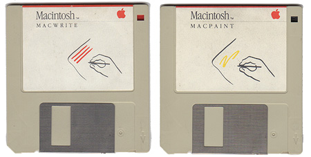
In addition to manuals and brochures, a bundled plastic box with a styled Apple on the cover contained the power cord, an Intro to Macintosh cassette, and bootable MacWrite, MacPaint and software tour diskettes (photo courtesy DigiBarn Computer Museum).

The artwork on the floppy disks also utilized the minimalist Picasso style.
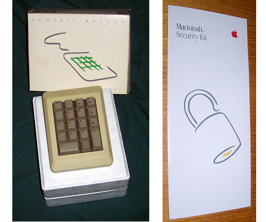
Apple used more Picasso style artwork for optional accessory boxes, some of which are quite rare these days: the numeric keypad for 128k/512k Macs, the Macintosh Security cable kit, and the external 400k floppy disk drive (which was really a necessity in those early days).

As with many collectibles, original packaging can increase the value of vintage Macs and components quite substantially. On eBay working 128k Macs with the original box and accessory kit easily sell for twice the amounts of their unpackaged brethren.
Back in the day many 3rd party products also joined in the fun. Here is the popular Copy II Mac disk utility, along with disks and manuals for a Daisy Wheel Printer Kit, utilizing the same minimalist style:


The Picasso Inspiration
Steve Jobs had long been an admirer of Pablo Picasso and frequently referenced his work and ethos. Jobs famously quoted Picasso in describing his own work at Apple and NeXT:
“Good artists copy, great artists steal”
A good example of Picasso using this graphic style is a still taken from Here’s to the Crazy Ones, the TV commercial which introduced the Think Different campaign after Jobs returned to Apple in 1997.

The Apple logo seen on this box of Ten Disks could easily have come from the same painting:

 During the rollout of the Macintosh back in 1984, Apple produced a limited edition promotional sign for the original Mac dealers. The sign has the Picasso line art along with the name Macintosh etched into a 10″ x 10″ piece of glass, manually beveled and painted. The glass was mounted on a beige plastic base containing an internal flourescent light, illuminating the glass from below.
There were about 1500 total Apple dealers at the time, and of those the dealers who carried the Mac were each allotted one sign. When switched on the sign sparkled like crystal and clearly announced that something new had arrived. With such a limited run these dealer signs have become coveted collectibles in recent years.
 The Lisa got the Picasso treatment when it was rebranded in 1985 as Macintosh XL, widening the chassis, reversing the mouse to the right side of the computer and adding more blue keyboard stripes. In retrospect this looks more like a “Fat Mac” to me than the 512k!
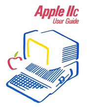 And here’s a rare graphic, the cover from Gary Phillips and Donald Scellato’s 1984 tutorial Apple IIc User Guide. This third party publication nicely utilized Apple’s new artwork style. Also notable is that Apple IIc utilized the striped case Snow White design language, which Macs didn’t adopt for several more years.
The Picasso logo was used alongside “Welcome to Macintosh” as the startup screen on all versions of the Mac System Software until it became version 7.6, when it was renamed “Mac OS”. Here for the first time the soon-to-be ubiquitous Macintosh “Face” logo was used instead.
This subsequently became the icon for the Finder under Mac OS X – itself influenced by Picasso.

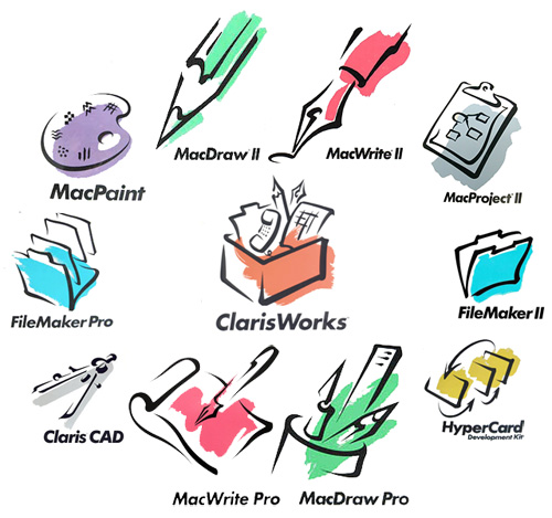
Apple’s onetime software subsidiary Claris got into the game for a while and went through it’s own Picasso phase when it created colorful line and brush graphics for some versions of MacPaint, MacDraw, MacWrite, etc.. These are a bit more fully rendered than other graphics of this style, but the essense is similar.
Apple has always had a large presence in education, predating the Macintosh. Another quote by Steve Jobs has him describing computers and the advantages they give us as Bicycles for our Minds, and at one point in the Mac’s development cycle Jobs even wanted to call his new computer Bicycle. He lost that battle, but an Apple University Consortium grant program called Wheels for the Mind built upon the concept and lasted for several years.

Wheels for the Mind promotional items [photo: Clement Mok]
Designed by Clement Mok, the image of the cyclist carrying a Mac with the mouse whipping in the breeze brings a smile to my face to this day. Apple continued with the Picasso style in other advertisements and promotions for the education market in the 1980s and 90s. The computer on the left of this button may repesent an Apple II, which coexisted with the Mac until 1993.
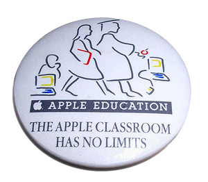
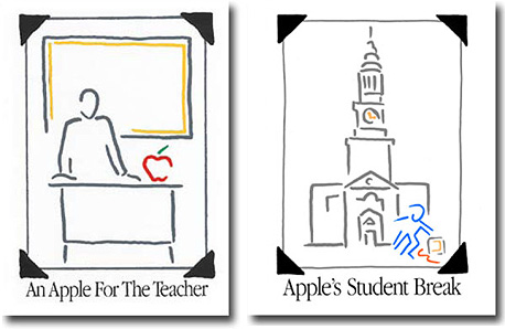
In education the Apples are red for teachers – and always take your Mac home on Student Break!
In the mid 1990s Apple ran several ads and campaigns centered around the theme You, a Mac, the World. These were the days of eWorld, CEBIT Germany, and MacWorld in Boston, and Apple was not yet (completely) beleagured. The Picasso style artwork was whimsical, but storm clouds were on the horizon.

A few years later Apple switched direction. Jobs was back, the logo lost its colors, and Apple’s advertising began to Think Different.
 Post Y2K and the Picasso Style Lives
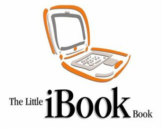
The passage of time may have seen Apple move away from this kind of branding, but the style and spirit live on in third party efforts. The cover of John Tollett and Robin William’s 2000 publication The Little iBook Book caught my eye for its Picasso treatment of a tangerine iBook. In my opinion it’s much easier to look at this way than in the actual neon orange!
 From the interwebs also comes this Picasso’esque version of the iconic Apple iPod, complete with clickwheel, earbud and an Apple. This graphic treatment would have been perfect for the iPod had it existed back in 1984 (though it would have been a Walkman back then), and in 2001 it was the product that evolved into the second coming of Apple. The iPod begat the iPhone, then the iPad, and was the beginning of Apple’s growth into a broader consumer electronics company.
I don’t know much about where this image comes from, although I’ve heard this may have been created during the launch of website MacRumors. As noted in the comments, this iPod artwork was the logo for the (now-defunct) website iPodHacks, run by Blake Patterson. Now we just need the iOS version!
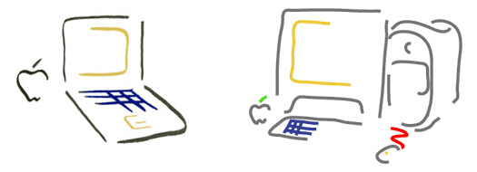
 Meanwhile back in the present day, iHelp Mac Users is an Illinois (US) based Apple consulting business whom I stumbed across in my travels. Their logo shows a nice rendering of a flat panel iMac, a MacBook, the Mighty Mouse and (I think) a docked iPhone in the Picasso style. The iMac inclusion is welcome, as this is the modern embodiment of the original Macintosh
Kudos for reusing the blue keyboard matrix from the original logo, too! A few more drawings of modern Macs in this style occasionally surface online, including this iBook and PowerMac G4 with flat panel Studio Display from The Apple Collection:
Finally, applying this style to the venerable Mac Finder icon brings me to the newest addition to the family (and one I’m personally proud of), the new logo for my Vintage Mac Museum. In homage to all of the above, the Finder gets rendered in fluid open strokes and original Mac colors: simple, vintage, and very Macintosh!
![]()
So here’s to Macintosh, Thinking Different, and another 30 years of Picasso style artwork!
UPDATE
In February 2014, John Casado revealed that it was actually Matisse, rather than Picasso, who was his main inspiration for this graphical style! Read the full story at Cult of Mac.
Excellent treatise, Adam! You should include artwork from the MacDraw and MacProject packaging, which I believe also were Picasso’d.
Thanks Dave. The original MacDraw & MacProject (etc.) packaging had black and white photo artwork, but I’d forgotten the graphics changed when they were rebranded as Claris products: MacWrite II, MacDraw II, etc..
I’ll keep those in mind for updates…The post has been updated.I used to run a website called iPodHacks. Its logo was inspired by the “Picasso” Macintosh logo. I received many a compliment about it over the years.
http://www.flickr.com/photos/blakespot/6357936595/in/photostream/
Also, the Picasso poster is one of my most cherished.
http://www.bytecellar.com/2004/08/22/picasso_macinto/
Thanks Blake, so that’s where the Picasso iPod artwork came from! Very nicely done, I will revise the article text to note your involvement.
Hi
I have a Mac 1 in a box in my loft, mouse, keyboard, etc. Also some disks, Jazz package and the original Mac printer. Do these have value? Should I sell them?
Bill
Bill – if it’s a 128k Mac with the original box, yes this has value. See this article for more info: http://vintagemacmuseum.com/how-much-is-my-old-mac-worth/
Just a quick note to say THANK YOU…
What a great article! Very well researched. I’ve referred several people to check this out. :)
Great information here. I have been researching an item I have, its one of the early Apple Macintosh wooden crates ( like a crate apples used to come in) It has the original rope handles and the solid colour red apple logo on the top, mint condition. Like to know when and how it was used to distribute the computer, and what its value might be =)
As far as I know, Apple never shipped the Mac in a wooden crate. Just cardboard boxes. It’s possible this was a promotional item from their gift catalog, or that somebody just put an Apple Computer logo on a standard Apple (fruit) crate.
Hello Adam, I have an apple poster in this style with a guy on a bike and the mac computer trailing behind. Do you have any info about this? I can’t find any information online. I’ve seen similar posters but none exactly like the one I have.
Steve, that’s the artwork for Wheels for the Mind. It was an educational initiative Apple was involved with during the 1980s. Some details about that artwork are noted in the article above.
The first 1984 first Apple Picasso Macintosh Logo Poster is presently listed on eBay.
Yes, those show up from time to time. Worth a few hundred dollars. Beware the people asking thousands.
Nice article.
Unfortunately, the “Picasso” art was not copying Picasso’s style, but Henri Matisse. The designer of the box art has stated this in print.
http://www.cultofmac.com/266265/macintosh-picasso-artwork-matisse/
He announced that Matisse was the inspiration, and some journalist called the box art “Picasso” at launch. This mistake has been repeated many times, including here.
All thoses lovely connections about Steve Jobs’ affinity for Picasso has nothing to do with the box art.
Steve – You are indeed correct. This fact is noted in an update at the end of the article.
I am the author of that post on Cult of Mac. After my article here was published (it also ran on CoM), the link was forwarded to John Casado. John contacted me to let me know the true backstory of his inspiration by Matisse and how the term Picasso artwork was coined by a journalist. He never corrected the mistake at the time, so the term “Picasso artwork” became the historical description of this style. I was curious how many people would read the followup article and take issue with the term. You are one of the first!
Besides the naming misnomer, as noted in this article the “Matisse/Picasso” style of artwork was used by Apple for many years long after the initial Macintosh launch. It has had a strong appeal ever since. As a bonus of writing these posts, John Casado and I have now become professional friends! I am honored.