Back to the Past with iOS 7?
So Apple’s latest and greatest iOS 7 is finally out, and it has seen the fastest adoption rate of any version of iOS released yet. So much so that I, a proverbial laggard when upgrading operating systems, 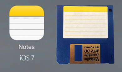 have decided to take the plunge earlier than usual to help my early adopter clients. Actually not too bad so far, I’m finding some nice usability changes throughout the OS. Alas as widely reported, it also contains a garishly ugly set of colors and icons which fully offend my visual sensibilities.
Where’s brushed aluminum when you need it?
But one new icon immediately brought on a sense of deja vu, that yellow and white square for the Notes application. Hmmm, where have I seen that before? Anyone remember floppy disks and peelable stick-on labels? Bingo!
I took a photo of one I have lying around at the Mac Museum, to compare and contrast. Eerily familiar, with rounded corners. I wonder if someone on Jony Ive’s team is a bit wistful for the 68k days?
Leave a Reply